Showing posts with label 2014 Finishes. Show all posts

Wednesday, January 7, 2015

WIP 2014 final tally


2014
Finishes from Original List
#1 - Sunflower Table Runner (Christmas #1) Class Sample gifted to my mom
#11 - Our Honeymoon Quilt for me and my husband
#12 - Fall Table Runner -"In Your Time" (Christmas #2) Class Sample gifted to my sister


Additional Finishes

#2 - Zig Zag Love - Class Sample; Red and White Challenges
#3-Airborne (not shown here ...to be revealed in the upcoming book "You Can Quilt" due out Feb. 2015
#4 - Race On! - commission
#5 - Red Starry Night - Piece 'n Pals Contest
#6 - Sunshine Makes the Flowers Grow - Piece 'n Pals Contest
#7 - Be Your Own You - commission
#8 - Harvest Time - from my stash for my kitchen, motivated by a Walla Walla Valley Quilt Festival Theme "A Wrinkle in Time" Contest
#9 - Tesseract Prism - Walla Walla Valley Quilt Festival Theme "A Wrinkle In Time" Contest
#10 - Scottish Plaid - INMQ Contest
#13 - Hugs and Kisses scrappy version from 2011 Shop Hop the Blues 2.5" strips - Class Sample gifted to Kelli
#14 - Dirt Racing T-shirt (KF#2 - commission)
#15 - The Artist - Sample gifted to Diane
#16 - One Block Wonder Table Runner - Christmas edition - Class Sample
Was able to wrap this up on New Year's Eve. Used Thermore batting and Omni black thread on the top; A&E Dyed Natural thread on the back. Added just a bit of fabric top and bottom on the backing that looks like old plank wood flooring and got it centered pretty well even though quilted on my longarm. Ditched the seams around the open black areas and did motif quilting in the printed triangles. In the all black triangles did 1/2" to the ditch and then filled in the centers. Diamonds got a little different treatment than the triangles, but similar.


Ready to bind:
Scottish Cross - Country Register Pattern Sample

Ready to Quilt
Baskets - WW Valley Quilt Guild 2006 BOM
Cool Penguin, partly pieced by Julie Tapley - Country Register Pattern Sample
Zoe - Fishy Fishy - Class Sample
Elephant's Play - Jungle Edge - Class Sample - gifted to childhood friend's baby
Elephant's Play - Water Hole - Class Sample
Turning Twenty - Grand Coulee Fishing - Class Sample

Piecing Progress:
Electric City - Class Sample   -->
Island Batik Spring 2015 Release - Meadow - "Woven Braid" - Pattern Sample for Market -- so excited to share this sneak peek! More will follow in the coming weeks and months. It will be revealed at Market in May. See below.


OWN
Fall Wallhanging

Totals:
Completed: 16
Note: client quilt tops quilted in 2014 .....70
Still WIP: 11

NO PROGRESS:
2007 Alaska Shop Hop
Out of the Darkness - Pam Bono

Projects I'd sure like to get on with!
  • Peace Park
  • Snowflake/blizzard --except that I used some of the snowflakes as inspiration for the Cool Penguin design.
  • Dogwood --have had this design, and now a missed challenge opportunity too.
  • 2007 Shop Hop the Blues - bow ties?
  • 2009 Shop Hop the Blues - fall leaves?
Commissions Under Contract:
Randolph Pillow et al

Thursday, January 1, 2015

2014 Commissions

Wanted to share the commissions completed for the year. Each had their own special connections and meaning and this forum gives me the opportunity to write about them a bit more than a description on Facebook.

Finish #4 - Race On!
Via a high school reunion facebook page, I re-connected with a classmate from many years ago! Through that connection, he asked if I would make a t-shirt quilt for a very worthy cause. We agreed on an estimated price and through some donations from others in my community with just the right fabric and assistance securing others, we pulled it off. So happy to report that it raised $750 for Kids Cancer.

Finish #7 - Be Your Own You
A dear friend and vital messenger in my life ....for her 4th grandchild.
Photos were printed in sepia tone of the baby and family members at Spoonflower.com to help it blend with the fabrics used in the quilt. A simple block design in the center with darker fabrics used in the border and more photos. Name/Birthdate info fuzzed out purposefully for publication purposes, but had embroidery work done at Sunflower Graphics here in Grand Coulee. Center fabrics from Chrysalis for moda. Border fabrics include Stefanie Brandenburg Urban Squares charm pack and School Days dot-to-dot by American Jane for moda. Basic Grey Grunge used for sashings of inner border. Warm and Plush batting. Spring Garland pantograph with Signature Peachy Tones thread. The grandmother loves butterflies and this pantograph has a few in it. The backing fabric includes the mother's favorite color.


Finish #14 - Dirt Racing T-shirt
Think back to Finish #3 above....the donors of those shirts were involved in this one which will go to one of the donors. A different effect as these honor Sammy Swindell and appeared to all be on dirt tracks, so used a Stonehenge fabric for the sashing. The back (shown below before quilting) was just a fun graphic way to make the checkered flag fabric sufficient for the size of the quilt and use the last t-shirt element from the 6 shirts I was given to work with. Almost a 'dirt racing stripe' effect. All shirts had front and back elements. The layout on this one was a bit challenging. I went through several iterations. Key considerations were the center column Sammy Swindell top 2 shirts said the name most distinctly so were placed there. The #1 shirts on the left and right were so dominant it seemed better to let them balance each other on the sides. I used the remaining ones to let the vehicle on the shirts point into the center to give a good framing. The binding fabric was actual tire tracks in the dirt. With the quilting I did on the diagonal 5 straight tread tire tracks. The rest of the quilt was my bone stipple which kinda looks like a tire tread too, but just lots on top of each other.


I would be remiss to not mention a commission that ended up NOT involving a quilt. I was very honored to be asked and glad we ended up with a great product ...even though it wasn't a quilted item. Sometimes when working with photos, its better to stick with FINE art. We had this printed on canvas and mounted. A great result!


If you're looking to have a quilt made on commission, these are things that I discuss with you: intended recipient, reason for giving or being made, anticipated use, size, interests, likes, favorite shapes, colors or room it might be used in so that it will coordinate. The part of the quilting process that I enjoy immensely is taking all of these points of inspiration and creating a treasure that may mean more to the recipient and the giver than to anyone else who may see it. It truly becomes a gift from and to the heart.

Tuesday, December 30, 2014

Special finishes


One of the most rewarding things is to 'give' ......this year I had four special projects that I gifted to special people in my life.

Finish #1

When making a class sample in 2013 for this fall table runner, I incorporated fabrics in the border that represent activities my parents enjoy and the center fabric fits in with their kitchen décor. The outer border was pieced as a strata with strips of fabric and then cross-cut.

The leftover strata I also gave to my mom and she made the placemats to coordinate. We enjoyed using it on the Thanksgiving table while we visited them in Arizona.


Finish #12

This fall themed table runner I named "In Your Time" and gave it to my sister. She understands the meaning...and at some point in time she'll have what she wants. ;-)

I originally made this design years ago as a guild mystery project. I was traveling at the time and saw these fabrics which reminded me of when I was in Japan and my grandmother passed away. The fall colors were spectacular that particular weekend and she always loved gold, so the gold accents in the fabric and the fall season made me think of her.

When I finally made it, the pattern didn't seem to work for me, so I re-drafted it and made it again as part of a class I offered a year ago in Grand Coulee. Just prior to Christmas I had to put my long-arm machine quilting on rest for a month. It took me a long while to get back to it, but I finally got it finished this year and was able to give it to my sister for Christmas. I chose a backing fabric that coordinates beautifully with her living room. She can use it any time of the year.


Finish #13

to a dear friend who is surviving breast cancer and all that goes along with that.


This started out as a collection of 2.5" x WOF strips obtained during the 2011 Shop Hop the Blues. Each shop had used the set of strips to make their own quilt design. I thought my Hugs and Kisses pattern might work up nicely if I could get the 'values' right.

When I decided to teach the Hugs and Kisses quilt as a class this fall, I got out the strips and decided that it was time to try and make it along with the class. Although the pattern calls for 2 5/8" strips, as long as you do everything consistently, it will still work just fine.  I organized the strips from light to dark and pulled the colors for the border that didn't quite go with the centers and made a strata to create a border.

All that was left were these pieces, the orange being the only complete strip I did not use:


As I pieced it together, it suddenly hit me that this was perfect for my dear friend battling cancer. It has a bohemian spirit in its result and it reminds me of that spirit in her, so I sent it off in hopes it would keep her comfortable and remind her of the love from a dear life long (well, since we were probably about 8 years old) friend.

I used this beautiful batik that is available in my studio for the backing and the binding. The coloring on the right is more true to what it looks like. The photo of the back was taken at night under lights.


This 'Heavenly Morsels' pantograph by Beany Girl Quilts is my go to favorite for quilting this design. I used the Fad 5 Signature variegated thread on the top and a coordinating burgundy thread on the back.

Finish #15

To another long time friend whose art work I'm honored to own. I hope this piece will daily remind her of who can inspire and sustain us. She is an outstanding artist and a beautiful person. The fabric line is 'Handmaids', the original quilt design is 'Draw Near'. I found the fabric at Experience Quilts in Odessa. I adapted it a bit so that the vertical outer borders had complete images of the fabric. This required the black sashing to be modified in a symmetrical way. The inner border called for the pink fabric, but I wanted to use the palette fabric. I chose to do the vertical green and blue (her favorite colors) and the light horizontal on top, and darkest horizontal on the bottom. The original binding suggestion was the red playtime fabric, but I chose to use a black/white chevron.

Each large panel square includes a scriptural reference.


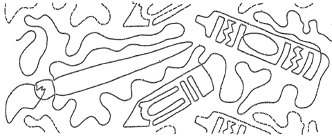
I found the perfect quilting pantograph to go along with it. There is a paintbrush, crayon and pencil.


On one of the paint brushes, I stitched in her first name.

Details on the back:


Here is hoping you all had a wonderful Christmas time.

Tuesday, October 14, 2014

INMQ 2014 Challenge, Storm at Sea Honeymoon Quilt and the WSQ Spokane show

Here we are again at the annual Inland Northwest Machine Quilter's Challenge. This year it was a simple enough piecing with lots of negative space to have fun.

After being in Scotland for a couple of weeks this summer, plaid kept coming to mind based on the piecing design. A few additional ideas came to life after taking the Cindy Needham class this summer in Spokane.

Thanks to Bottom Line and So Fine! threads, here it is. I failed to get an overall shot of the quilt upon completion of binding (a quick ship it timing issue) so I'll post one of those after the show.


Backside:


It will be at the Spokane show, October 17-19, 2014. I hope you can come out and enjoy!

I've also put these pieces in the show that I've blogged about in the past. The theme this year is "My Heart Belongs to Quilting".

Mi Amore 
This will also be offered as a class in January 2015 in Grand Coulee.


Zig Zag Love --on theme again and made this year as part of the Red and White Challenges. Hope you'll check them out and vote! 10/14-24.


Recent challenge pieces for Piece 'n Pal Quilt Guild - Republic.
Red Starry Night  (15"x15")                     

Also in the Red and White Challenges voting linkup. Hope you'll check them out and vote! 10/14-24.


Sunshine Makes the Roses Grow (15"x15") Another Piece 'n Pals 2014 Challenge Piece


Harvest Time - motivated by WWVQuilt Festival's "A Wrinkle in Time" theme (later realizing that was a book and this might only marginally work for the theme challenge....I did come up with another design - Tesseract Prism but wasn't sure I would pull off the concept in time so didn't submit an entry to the WSQ show).


and my latest ...a UFO of over 5.5 years ....this Storm at Sea design turned into 3 hearts and some turtles. The storm part has no correlation, seriously, but in EQ7 there is a Storm at Sea design that has 3 hearts, and while on our honeymoon (2009) I saw it and thought I'd play with it a little bit, adding the turtle by shading various pieces of the 'storm-at-sea' design. We saw turtles while in Hawaii on our honeymoon. May 2012 Storm at Sea as a design was taught at the Krazy Horse Quilt Show pre-class. So, I got out my design and started the cutting and piecing and continued working on it while my husband took a part-time job in California. In 2013 Toni Whitney taught the Pendleton show pre-class...but alas I couldn't make it. After teaching my own fusible applique class recently using Toni Whitney designs, I decided to incorporate her turtle pattern into the quilt as an applique in the border. I'm very pleased to have gotten this put together finally and include it in the show. I put in the entry before the center was even pieced together but knew the theme of this year's show should motivate me to get it done. I think I was crazy...but here it is! Whew! "Our Honeymoon Quilt"


I didn't even get a full picture of it because it was finished in the middle of the night and delivered to the messenger before dawn so it could get into the dropoff location for the show in time.

Ah well...hope you can come to the show and check them all out. Friday and Saturday includes voting opportunities.

Update: I was able to get this full photo at the show.

Monday, September 22, 2014

A Wrinkle In Time Challenge

When I first thought about this theme, "A Wrinkle In Time" ...I immediately thought of a project I had in my stash called Harvest Time --just simply the word 'time' triggered that. I got started on the project and someone mentioned the challenge was the title of a book and I thought, OH NO! So, I quickly started doing some research about the book and a particular word caught my eye. Tesseract.

I have not read the book, but read the Wikipedia overview and decided to jump at this particular 'shape' of a Tesseract and see what I could come up with. If you look at the Schlegel Diagram of it, it provides a great 3d perspective of the description. If it can be drawn, then surely I can make a quilt from that, right?

So, I took the image and uploaded it into EQ7 as a tracing image. I initially tried to just draw it on a circle grid with multiple rings and 8 spokes but I just didn't seem to be getting the points to connect right, and at this writing I'm not sure why I would have even tried to do that. Anyway, the EasyDraw screen allowed me to do what I wanted a bit easier. I wanted to create templates to just piece it together.


My first rendition kept it in the same color family but different shading.


Ultimately I decided to go with a prism effect and considered even more of the cross section impacts than my original shading.


Here is my coloration of that, and so I named it Tesseract Prism.

Print as templates based on the size you want to create it, tape 'em up, mark the colors, find the fabrics and start piecing. With the wonderful templates provided, it went together quite easily. Yes, I had to be careful with all the weird joins, but after going through the Skill Builder Sampler you could do it too!

With time running out, I decided to just ditch the surfaces and 'face' the edges to enter it in the show challenge. This was entered in the Walla Walla Valley Quilt Festival 2014 "A Wrinkle In Time" Challenge.


I believe I may want to work on designing some quilting that will show intersections of surfaces, so if you have ideas, I'd love to hear about them! This one needs more quilting, but for its original purpose it is done. I do think it will have a further evolution. Time will tell.

There was another Tesseract created for the challenge. Check out my www.facebook.com/kissedquilts page and go to the Photo Album Walla Walla Quilt Festival 2014 to see it.


Thursday, September 18, 2014

A challenge - done two ways

The Republic Quilt Guild aka Piece 'n Pals put up a challenge for this year's quilt show that takes place as part of the Ferry County Fair August 29-31, 2014.

Requirements: Any Star block, Churn Dash, Log Cabin (no larger than 1.5" unfinished logs) and House Block. 6" finished blocks, 14.5-15.5" finished dimension of the piece; recognizable amount of the challenge fabric (red rose tone on tone). Sandwiched, quilted and bound. Embellishments permitted. Hanging sleeve and name on the back.

Judging considerations: accuracy of piecing, neatness, cleanliness and adherence to above-mention requirements.

Hanging Sleeve on a mini?? ok.... ;-)

Hoping that once it is quilted and blocked the finished sizing (always smaller) will be understood.

I came up with two different designs within these parameters and was able to use ONE challenge Fat Quarter to make both. This is the red tone on tone rose print challenge fabric.

I enjoy these types of challenges to work within the limits, but be creative and think outside the box to pull it off.


The red/white one I finished the edge with a 'facing' (a first for me) and the sashings and border had star points that allowed another star in the center to give it 3 stars in the sky and parts in the corners. Apparently the star corner by the house made it look 'skewed', but it still won Judges Choice in the challenge. I'm linking up this design with the Red and White MAKE it challenge.


The quilting tried to emphasize the red bits and quilted down the white background quite extensively. To do again, I'd likely put some stars in the sky with the quilting. I was about to 'face' it and realized I had left the upper right corner of the churn dash unquilted, so had to put it back on the table and get it done!


In the picture window version, I used Lumiere Sateen for the sashing and borders. Bound it with Cotton Sateen. The log cabin block wasn't pieced very accurately and got a bit 'squify' in its squareness. I think given the size it would have been better to paper piece it to keep it square. Metallic thread was used in the sun and reflection in the water.

Tuesday, September 16, 2014

Harvest Time

In 2010, Paintbrush Studios came out with a line of fabric of fruits and vegetables called Farmer John II. A lovely collection of colors and beautiful illustrations of the things we eat from the earth.

I had seen the free online pattern provided by the company, designed by Quilts by Nature Pattern Company and collected some of my favorite fabrics (not necessarily the ones used in the pattern).

My former living location--Walla Walla Valley--hosted the 2014 Quilt Festival with the theme "A Wrinkle in Time" (Sept 19-21, 2014) ....well, somehow just the word TIME made me think of this quilt 'Harvest Time' that I had saved for a future project. So, I got it out and went to work on it. Note: "A Wrinkle in Time" I later learned is the name of a book. Once I did a little research on that, I came up with another design on my own that I'll write about in a future blog post. Here it is prior to quilting with backlight (used a magnet to put it up on the door to the studio).

I found a few things, that if you want to make it yourself, you might want to know before you get too far into it. Be sure your printed pattern did not 'scale' to a size of block you don't want. It gives directions for 6" and 8" blocks so you can have a different sized result. Double check the first page you print of the paper piecing patterns to be sure it will result in the size you want. I re-printed ALL of mine (turned it over on the back and did it again that way I at least didn't trash my good foundation paper). Unfortunately I had already pieced two of those very intricate blocks to find out they weren't big enough. Ah well, it could have been the 'circular' ones, grateful it wasn't!

1. Make 8 copies of page #'d 5. There are two blocks illustrated on this sheet, but you need 4 for each block, and you need 2 versions of each block. So that requires 8 copies (not the 4 indicated on the pattern). The outside element of the 3 quarter pieces is not drawn correctly on the lower pattern on the page. Use the upper part again for those blocks. Easiest to just re-draw the stitching line on the lower ones to match the upper ones. If you don't do this, these lower two blocks 'watch band' fabric won't match up with the adjacent blocks.

2. Make 8 copies of page #'d 6. (not 6 copies as indicated) You need 4 on top and 4 on the bottom to make that border.

3. Page #'d 4 didn't print to give an unfinished 6 1/2" block. It was slightly larger. Just trim to leave 1/4" seam allowance on the blocks that had a point in the edge of the middle section and then center and trim the rest of the block to make sure you have a 6 1/2" unfinished block.

4. Block # 26 is illustrated in b/w and described different than the colored illustration. The Potatoes should be on top and the Watermelon 'behind' to create the woven effect in the colored illustration. You'll need to cut the opposite Watermelon/Potato fabrics based on what is written. It also seems that the 'hole' of the watch band in the middle of the 3 ought to be Watermelon since it is 'underneath' and not the background fabric as generically applied throughout the rest of the quilt.

5. Given the effect of appliqued holes for the watchband, how about doing reverse applique so that there is a DEPRESSION behind the watchband for the 'hole'? I did this by cutting a larger applique piece and basting it to the back of where I had cut a slit for the hole.  Then needle turned the watch band fabric and appliqued it to the garlic background fabric that had been basted behind it. Some cuts into the band were necessary to get it to turn under at the curves. I chose to do some more squared just because it was easier.

6. The thin grey band clasp means a lot of layers of fabric if you press towards the clasp. If you press away from the clasp, then the clasp will seem recessed and realistically it would be raised. What about adding 2-sided fusible interfacing and cutting the entire piece out? This wouldn't give it much lift, but would minimize the layers and is 'topically' applied. I actually pieced the ends into the seam very carefully and then fused the entire piece on the top. This meant that all of the blocks with a clasp I either only used the middle paper foundation and minded the issue described in #3 above, or just rotary cut the sides and center and then added the clasp as described.

Hints to the piecing: when you get to the center circle you can either cut 1/4s as the color illustration represents or use a whole circle to apply to the paper pieced blocks (4 in total). I found that doing this piecing by hand worked fairly well and I got better at keeping it circular.

I used Warm & Plush for the batting and a backing full of fruit and vegetables.


For the quilting I did an 'onion' type fill in all of the garlic areas with Wonderfil Invisifil (100 wt) off white thread, including in the watch band holes. All watch bands and centers were stitched in the ditch. Each watch face had hands quilted into it and sometimes other quilting motifs/fills to give it some depth. The hands and center were then colored in with a micron Fabric marker. I used a Wonderfil metallic to straight stitch just inside the edge of the clasp fused applique elements.

Maybe you'll see it at the WWVQFestival Sept 19-21, 2014.

I'm excited to hang this in my kitchen, finally!

Wednesday, April 23, 2014

Red and White - Make It Challenge


Following along with the Year of Red and White Challenges, I've made a red and white quilt!

This design is mine and was entered in Phase II of the challenges.

Let me know if you'd like it as a pattern.

The unique shape of the chevron is very popular and I've seen it constructed in several ways, but not like this. I wanted to minimize the number of seams and minimize the 'bias' edge handling.

Using a big square and cutting it on the diagonal both ways provides the triangle used for all rows except at the ends. In order to be efficient with the fabric, I've got a trick on creating those from within one of the larger cuts.

This is the lap size approx. 48"x60" hanging over our deck with a slight breeze.


The freemotion quilting was an experiment to try a variety of ideas, so it is not perfect, but I'll walk you through each quilting design and the border.

Solid Red  --three separate areas of the dark red, the top one is a heart with echoed once and then a scallop type fill in the background;
 
 
the middle one is a design taken from the border print with a pebbles and swirls fill in the background. The swirls on the sides should have been bigger and the top should have been smaller to provide better balance with the larger motif used in this section.

White with red circles -- This one probably detracts from the quilt more than I'd like it to, but the fabric had small white life saver type rings on it, so used that as inspiration. The parallel lines inbetween were a big tricky, but by the time I did the 2nd set I had a good system and was able to do the entire zig zag in one continuous line except for the inner round of each circle.

the bottom one is also taken from the border print and is a heart flower with two leaves and arching edge at the very bottom. The background is an echo in the large triangle. The side corners have a scroll going both directions with dense fill in the background.


Red w/white feathers --fabric is so busy that you can't really see the quilting, but I did a big feather with pearls in the stem.
 
Red w/bubbles --again ...the fabric is busy but did big pebbles.
 
White with red circles -- This one probably detracts from the quilt more than I'd like it to, but the fabric had small white life saver type rings on it, so used that as inspiration. The parallel lines inbetween were a big tricky, but by the time I did the 2nd set I had a good system and was able to do the entire zig zag in one continuous line except for the inner round of each circle.


Inner white border - mimicking the zig zag of the quilt design, I echoed a zig zag along the white border adding the heart flower with leaves element from the printed border to fill one side of the zig zag. The other side of the zig zag was left un-quilted. No background fill in the inner border at all.
 
Red border print - following the motif in the border to quilt it sufficiently. Border is busy so just quilted it enough to be sufficient for consistent density.
 
Outer white border - Really had fun with this one. Similar to the inner white border with the zig zag and echoing it except when I got to the corner and it kinda tapers to only a single line. Fills are intense in this area so the zig zag will really pop. Motifs from the red border are used (heart flower with leaves) and a ribbon candy fill on the outside triangles on the short ends of the quilt and the inner fill uses pebbles on all sides. The final inside triangle before each corner used a loop in a loop to fill--always looking for a quicker way to get a dense fill. (see upper detail photo for closeup).
 
Here is a photo from the backside so you can see some of the quilting motifs a bit better.

This will be at
1. the 22nd annual Spring Fling Quilt Show "Fronen Steppdecker" in Odessa (WA) Quilt Show April 25-26, 2014

2. the Krazy Horse Quilters Annual Show in Pendleton (OR) May 3-4, 2014

3. the Ferry Co. Piece 'n Pals Quilt Show Aug. 28-31, 2014. (UPDATE: A Blue Ribbon Winner from the Ferry Co. Fair and received a ribbon from WSQ - 2nd place).

4. WSQ-Spokane Quilt Show, Oct. 17-19, 2014.


Update: September 2014
This was shown at the Piece 'n Pals Quilt Show during the Ferry Co. Fair in late August 2014. It received a blue ribbon and the WSQ 2nd place ribbon.

This will be in the WSQ Spokane show in October.

I actually made another red/white quilt this year too. Find details about it at http://kissedquilts.blogspot.com/2014/09/a-challenge-done-two-ways.html  It received the Judges Choice at the Piece 'n Pals Challenge.